From HTML Basics to Modern Web Design: My Journey with CSS, Tailwind, and GSAP
Remember that moment when you first see a beautifully designed website and think, "I wish I could build something like that"? That was me several months ago, staring at my browser's developer tools, completely overwhelmed by the maze of HTML tags and CSS properties. Fast forward to today, and I've built dozens of responsive, animated websites that I'm genuinely proud of.
The journey wasn't linear, and honestly, there were moments when I questioned whether I'd ever "get it." But here's what I learned: every developer starts somewhere, and the key is building one project at a time, learning from each mistake, and gradually pushing your boundaries.
The Foundation: Starting with Pure CSS
When I first started, I made the classic mistake of jumping straight into frameworks. Big mistake. I quickly realized that without understanding CSS fundamentals, I was just copying and pasting code without truly comprehending what made designs work.
So I went back to basics. I spent weeks mastering flexbox, understanding the box model, and learning how cascade and specificity actually work. It was frustrating at times, but this foundation became crucial for everything that followed.
The Breakthrough Projects
After mastering the basics, I decided to challenge myself with real projects. Here's what I built and learned from each:
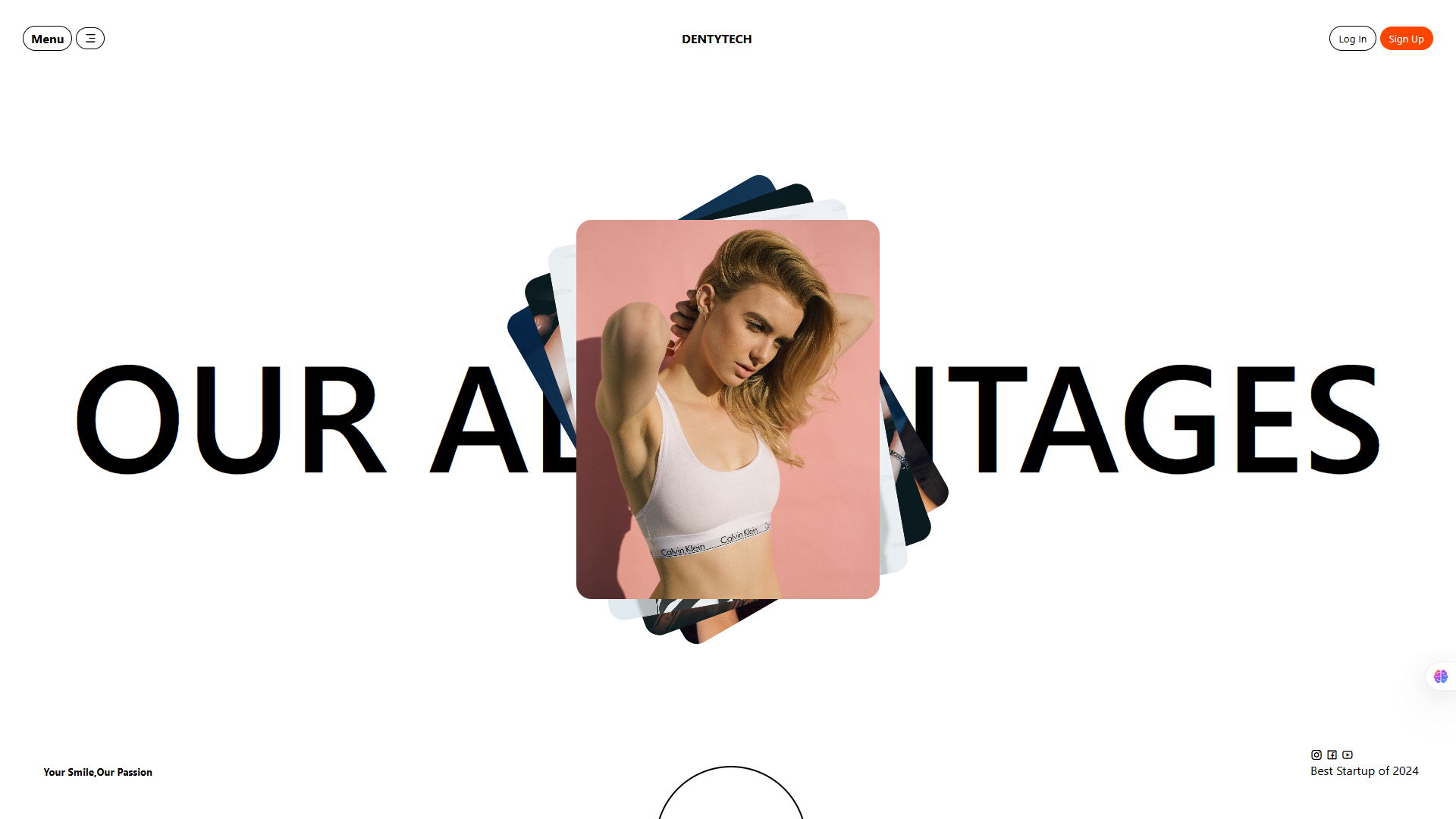
Project 1: dentytech - Modern Fashion Startup
What I Built: A clean, professional hero section page for a fictional fashion startup with image galleries.
This was my first attempt at creating something that looked genuinely professional. I focused on typography, spacing, and creating visual hierarchy without any fancy animations.
Key Techniques Learned:
- Image positioning for rotating Design
- Proper semantic HTML structure
- CSS pseudo-elements for decorative effects
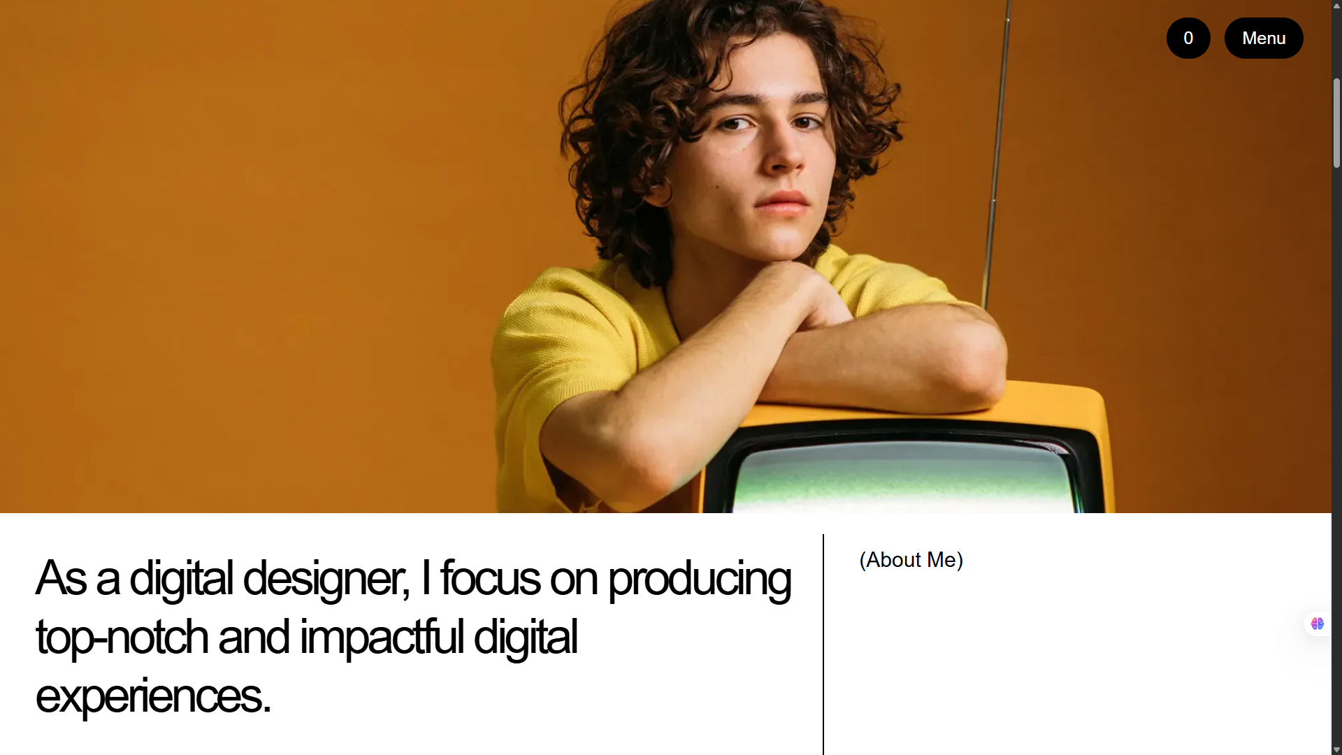
Project 2: Portfolio Website
What I Built: A professional, sleek portfolio inspired by Bent Lindberg's minimalist design approach.
This project taught me that sometimes less really is more. I spent more time removing elements than adding them, learning how white space and typography can create elegance.
Key Techniques Learned:
- CSS Grid and Flexbox working together
- Design flow and creative thinking process
- Custom CSS variables for consistent theming
Personal Insight: I realized that great design isn't about having the most features—it's about presenting information in the clearest, most beautiful way possible.
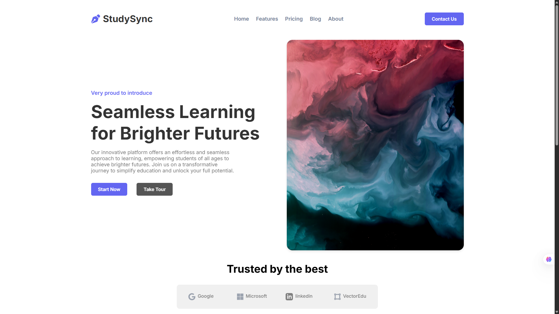
Project 3: StudySync - Educational Platform
What I Built: A comprehensive landing page for an educational platform focused on "Seamless Learning for Brighter Futures." The goal was to create something that felt approachable yet professional for students of all ages.
This project pushed me to think about user experience beyond just aesthetics. How do you make learning feel exciting through design alone?
Key Techniques Learned:
- Advanced media queries for true responsive design
- CSS-only interactive elements (no JavaScript needed!)
- Accessibility best practices for educational content
- Creating visual hierarchy for content-heavy pages
Breakthrough Moment: Successfully creating CSS-only accordion menus that actually felt smooth and professional. It was the first time I realized how powerful CSS could be without JavaScript.
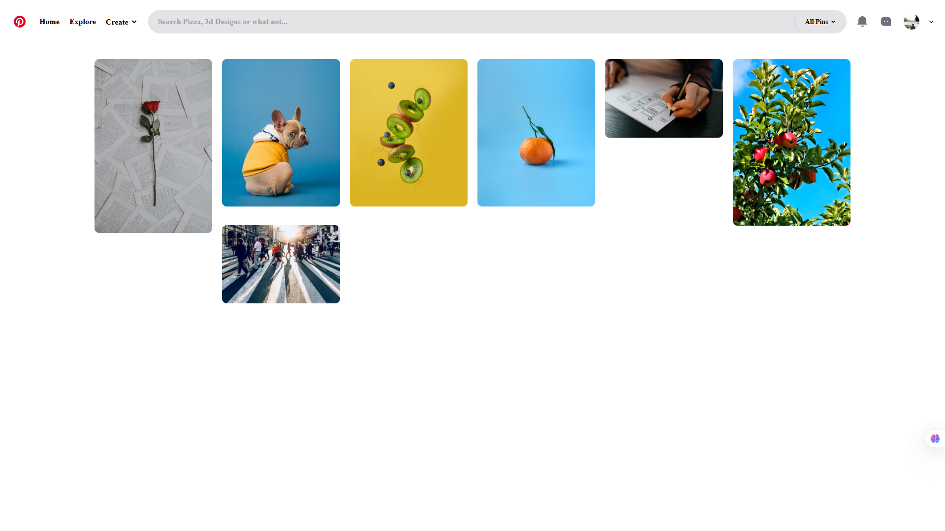
Project 4: Pinterest Clone
What I Built: A functional Pinterest-style layout focusing on the visual browsing experience that makes Pinterest so addictive.
This project was all about mastering CSS Grid in ways I'd never attempted before. Creating that perfect masonry layout without JavaScript was a puzzle that took me days to solve.
Key Techniques Learned:
- Advanced CSS Grid techniques for masonry layouts
- Lazy loading implementation with pure CSS
- Image optimization strategies
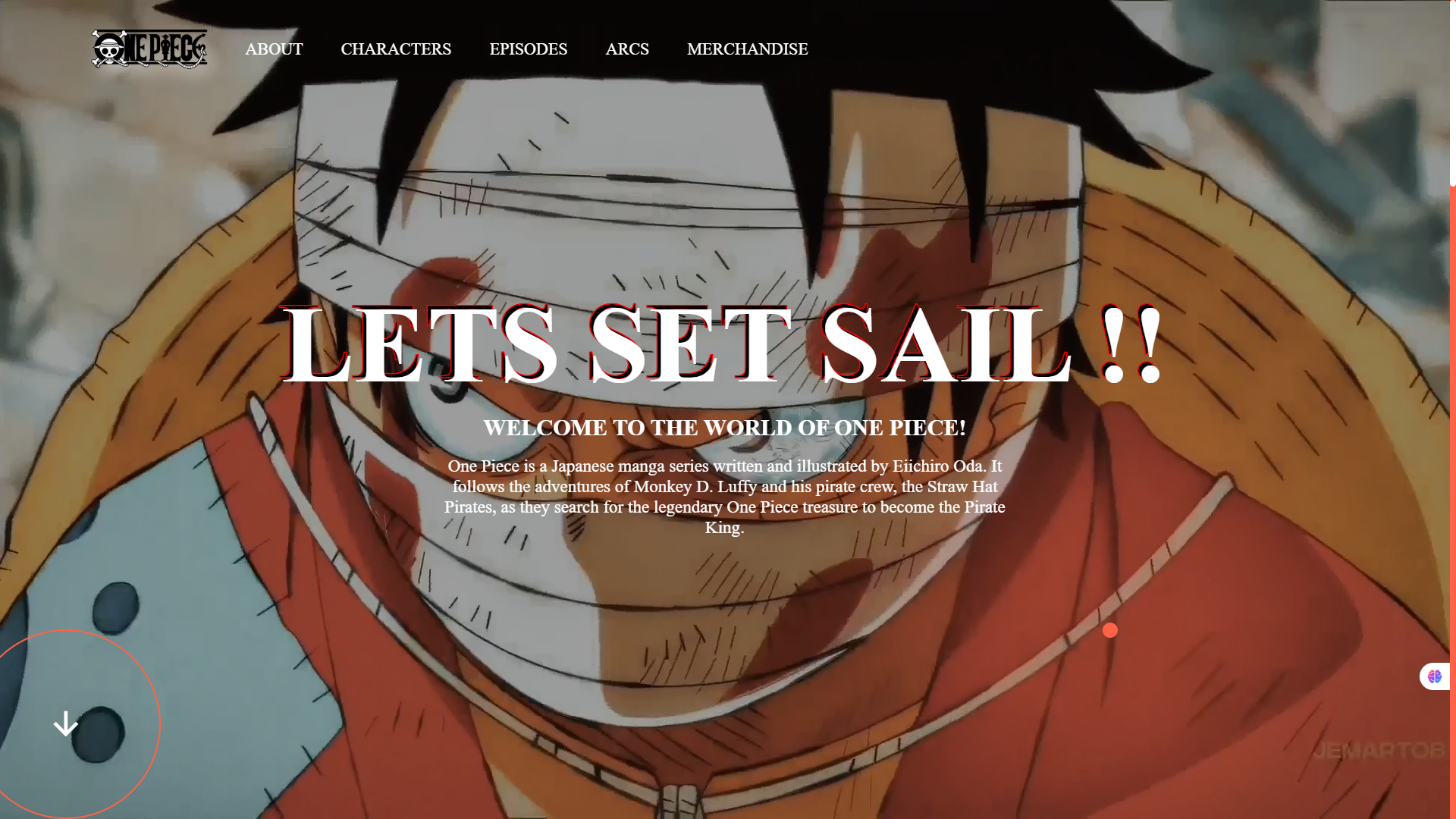
Project 5: One Piece - Entering the Animation World
What I Built: An immersive One Piece-themed landing page that brought anime aesthetics to the web through pure CSS and GSAP animations.
This was where everything changed. I discovered GSAP and suddenly realized that websites could feel alive in ways I'd never imagined.
Key Techniques Learned:
- GSAP timeline animations
- Custom cursor effects with CSS and minimal JavaScript
- Creating cinematic scroll experiences
- Balancing performance with visual impact
Game-Changing Discovery: GSAP's ScrollTrigger plugin opened up a world of possibilities. Suddenly, I could create experiences that felt more like interactive movies than static websites.
The Game Changer: Discovering Tailwind CSS
After building several projects with vanilla CSS, I kept hearing about this thing called Tailwind CSS. I was skeptical at first—utility classes seemed like inline styles with extra steps. But once I tried it, there was no going back.
Why Tailwind Changed Everything
The speed increase was immediate and dramatic. Instead of writing custom CSS for every component, I could compose designs directly in HTML. More importantly, I stopped context-switching between files, which kept me in a flow state longer.
Here's the same product card, before and after Tailwind:
Before (Vanilla CSS):
.product-card {
  background-color: white;
  border-radius: 12px;
  box-shadow: 0 4px 6px rgba(0, 0, 0, 0.1);
  padding: 1.5rem;
  transition: all 0.3s ease;
  transform: translateY(0);
}

.product-card:hover {
  box-shadow: 0 8px 25px rgba(0, 0, 0, 0.15);
  transform: translateY(-4px);
}

.product-title {
  font-size: 1.25rem;
  font-weight: 600;
  color: #1f2937;
  margin-bottom: 0.5rem;
}

.product-price {
  font-size: 1.125rem;
  color: #10b981;
  font-weight: 500;
}
After (Tailwind CSS):
<div
  class="bg-white rounded-xl shadow-md p-6 transition-all duration-300 hover:shadow-xl hover:-translate-y-1">
  <h3 class="text-xl font-semibold text-gray-800 mb-2">Product Title</h3>
  <p class="text-lg text-green-500 font-medium">$99.99</p>
</div>
The difference was staggering. What took 20+ lines of CSS became a single HTML element with utility classes. But more than speed, Tailwind taught me to think in systems—consistent spacing, colors, and typography that scale across entire projects.
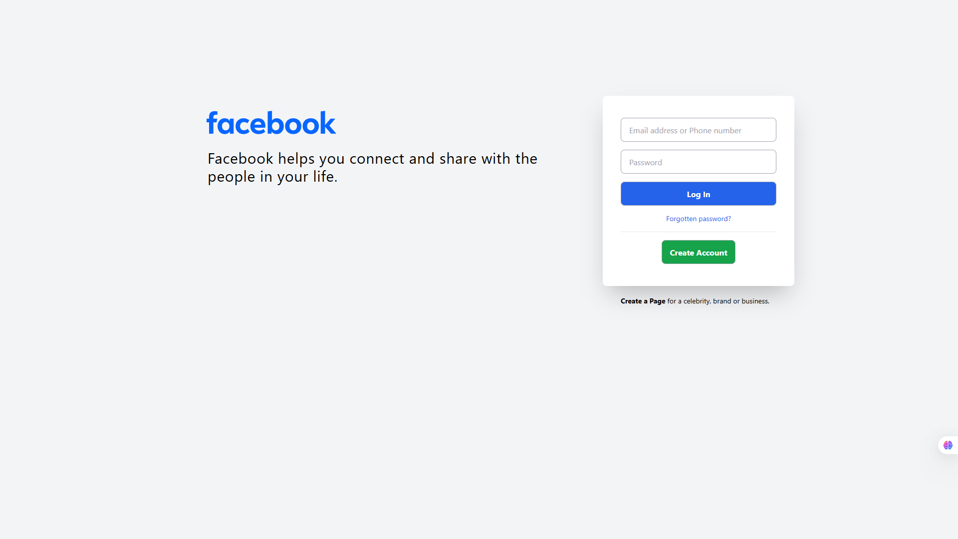
Project 6: Facebook Login Page Clone
What I Built: A pixel-perfect recreation of Facebook's login page, focusing on the subtle details that make familiar interfaces feel trustworthy.
This project was less about creativity and more about precision. Sometimes the best way to learn is by recreating something you use every day.
Key Techniques Learned:
- Tailwind's component composition patterns
- Form styling best practices
- Creating trustworthy, familiar user interfaces
- The power of Tailwind's design system approach
Unexpected Learning: Recreating familiar interfaces taught me how much thought goes into seemingly simple designs. Every button size, color choice, and spacing decision serves a purpose.
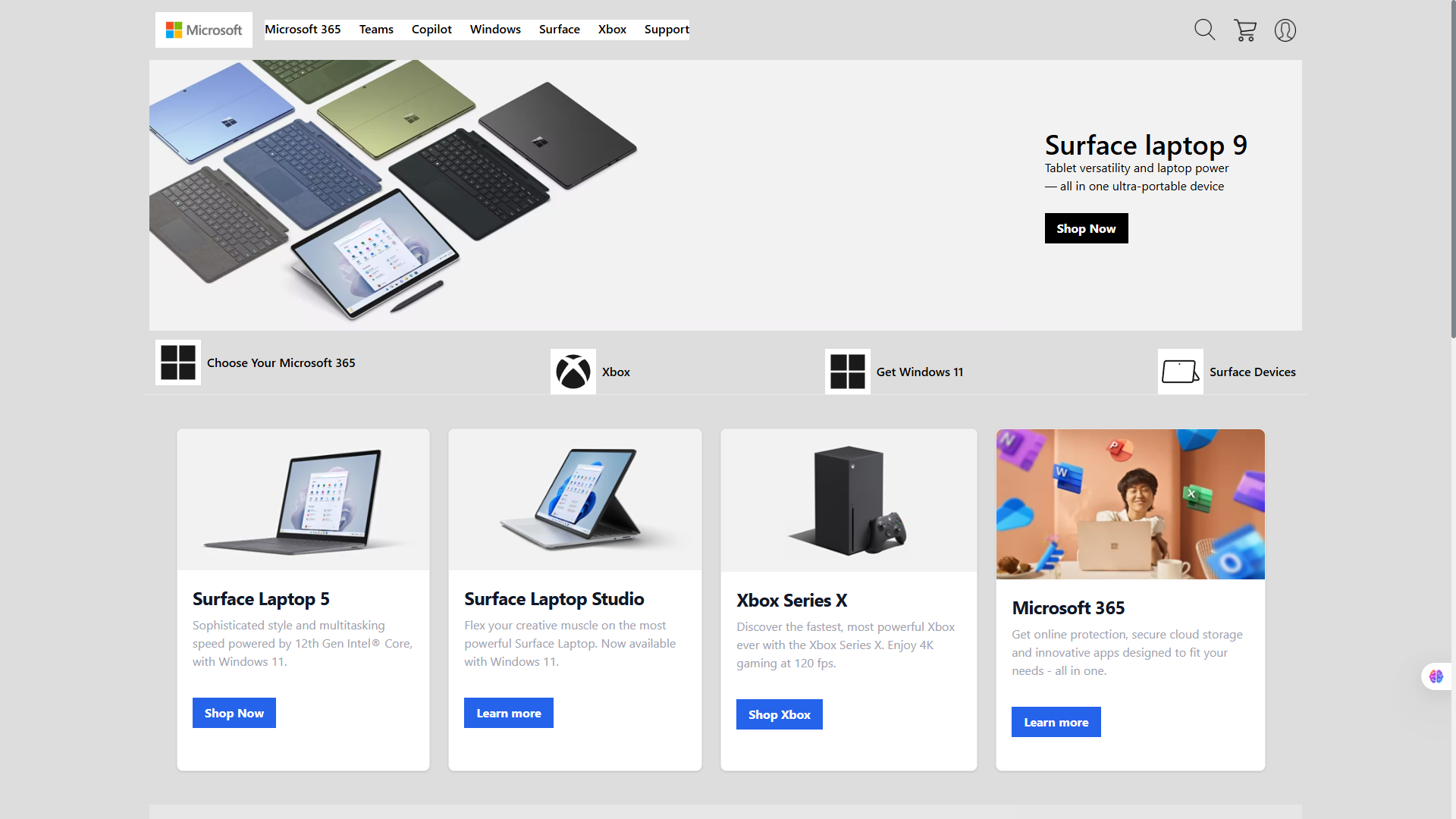
Project 7: Microsoft Landing Page
What I Built: A modern interpretation of Microsoft's enterprise-focused landing page design, emphasizing clean layouts and professional aesthetics.
Key Techniques Learned:
- Enterprise-level design patterns with Tailwind
- Creating visual hierarchy in content-heavy layouts
- Balancing professionalism with modern web aesthetics
- Advanced Tailwind composition techniques
Professional Growth: This project taught me that great design isn't always about standing out—sometimes it's about communicating clearly and building trust through familiarity.
Key Lessons from My Journey
1. Master the Fundamentals First
Don't rush into frameworks. Understanding vanilla CSS deeply made every framework I learned later much more intuitive.
2. Build Real Projects, Not Just Tutorials
Each project taught me something new because I was solving real design challenges, not just following along with predetermined solutions.
3. Embrace Constraints
Working without JavaScript forced me to be creative with CSS and truly understand what's possible with modern web technologies.
4. Design Systems Matter
Tailwind didn't just make me faster—it taught me to think systematically about design decisions.
What's Next?
The beautiful thing about web development is that there's always something new to learn, always a better way to solve problems, and always another creative challenge waiting.Hence, currently exploring JavaScript in depth now.
Pro Tips for Me and to Fellow Beginners
- Start with mobile-first design - it's easier to scale up than down
- Use browser dev tools - they're your best friend for debugging layout issues
- Don't be afraid to recreate existing designs - it's one of the fastest ways to learn
- Focus on one technology at a time - master CSS before moving to frameworks
- Build a portfolio of diverse projects - each one teaches different skills
The web development journey is challenging, rewarding, and never boring. Every project teaches you something new, and every problem you solve makes you a better developer. If you're just starting out, remember: everyone begins somewhere, and the most important step is simply beginning.
Want to dive deeper into modern web development? Check out my other
Related Posts: